Animation can make a website feel more intuitive and memorable. A button responding to a click confirms an action; a simple transition can show how one piece of information relates to another. But movement that delays content or makes a page difficult to use works against the people visiting it.
The goal is to choose motion that helps the experience, then check that it works across devices and accessibility settings.
Start with a reason for the movement
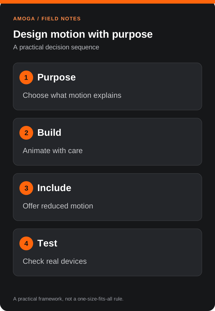
Before adding an animation, ask what it helps the visitor understand. Motion is useful when it draws attention to a change, explains a relationship, or confirms an action.
- Navigation: A menu opening can show where it came from and where to close it.
- Feedback: A button can respond immediately when a visitor clicks it.
- Storytelling: A product image or diagram can reveal details in a sequence that makes the idea easier to follow.
- Orientation: A transition between related views can help readers keep their place.
If an effect has no clear purpose, consider leaving the content still. The important information should remain available even if the animation never runs.
Keep the page responsive
Every animation adds work for the browser. Large images, complex visual effects and multiple moving elements can compete with the page’s core job: responding to the visitor.
Simple movement and fades are often a good starting point. Effects that repeatedly change an element’s size or the layout around it may require more work. Neither choice guarantees smooth performance; the result depends on the page, the device and everything else running at the same time.
Test the experience on a mid-range mobile device as well as a desktop. Pay attention to delayed taps, dropped frames, battery use and whether content remains readable while effects are running.
Coordinate scrolling and animation
Smooth scrolling can make a long page feel considered, especially when it supports a story or a sequence. It should never make it difficult to reach the content, use the keyboard or navigate a menu.
If a site uses a smooth-scrolling library alongside scroll-based animations, the two systems need to be coordinated so visual changes follow the visitor’s position. Check that the page behaves correctly when a menu opens, a link jumps to a section, or the browser window is resized.
For long articles, reading is the priority. Keep the scrolling experience subtle and make sure visitors can still reach links and headings without unnecessary delay.
Design for reduced motion
Some visitors prefer less motion because animation can be distracting or uncomfortable. Respect their device’s reduced-motion setting and offer a quieter experience.
That might mean replacing a large moving transition with a simple appearance, removing parallax, or showing content immediately. The information and actions should remain the same; only the movement changes.
Also check that animations do not flash, obscure text, or require someone to wait before they can use the page.
Make typography move without disrupting reading
Animated headlines can give an introduction character, but they should not push surrounding content around or hide the message for too long. Load and test the chosen fonts, allow enough space for headings, and keep the final text visible if animation is unavailable.
Use short, restrained reveals where they add emphasis. On a long article, a stable heading is usually more useful than animating every line as the reader scrolls.
Test the complete experience
Before publishing, review the page as a visitor would:
- Open it on a phone and check that the main content appears promptly.
- Scroll through the page and use the menu, links and forms.
- Check the page with reduced motion enabled.
- Navigate using a keyboard and confirm that focus stays visible.
- Test with a slower connection and watch for images or fonts shifting the layout.
- Compare the experience before and after adding an effect. Keep the animation only if it contributes something useful.
Good web motion supports the message and the person reading it. It should make an interaction clearer or more engaging while leaving the website quick to use.
Explore our website design services if you are planning a more thoughtful digital experience.